A Buyer's Guide to Coaster Print Color: CMYK, Proofing, and What to Expect
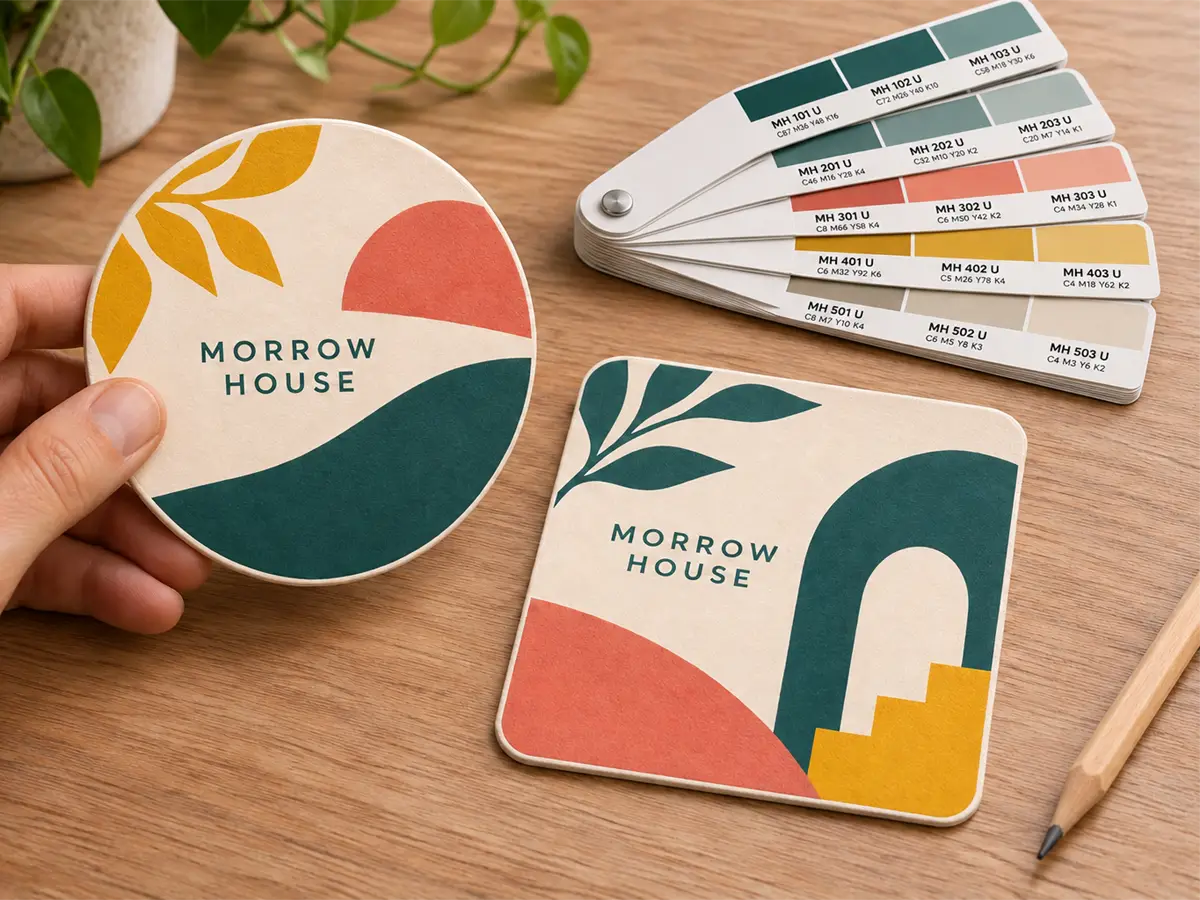
 Great color on a coaster starts before the ink meets the pulpboard. - Coaster Factory
Color mismatches can lead to reprints, wasted material, and delays. Understanding how screen colors translate to printed pulpboard helps you set clear expectations before production.
Here is the reality: your screen displays color using light (RGB). Your coaster gets printed using ink (CMYK). For offset-printed coasters, pulpboard's uncoated surface and absorbency also affect how colors appear. These differences mean your printed coaster may look different from the version on your screen. Some variation is expected because screens and printed materials reproduce color differently. That is physics.
This coaster print color guide explains what actually happens when your brand colors move from screen to substrate. You will learn why certain colors shift more than others, how pulpboard and the print process affect the final result, and how artwork review and clear color requirements help prevent avoidable production errors.
This guide focuses mainly on offset-printed pulpboard coasters. Our Short Run coasters are digitally printed and have a slight sheen, so their finish differs from offset-printed coasters.
Summary:
- CMYK printing has a narrower color range than the screens your designs are created on. Some brand colors will shift when printed.
- Offset-printed pulpboard has a matte appearance, and colors can look softer than on coated paper. Short Run digital coasters have a slight sheen.
- Review your proof to confirm the artwork, and discuss critical color requirements before approving production.
Proofing lets you check the artwork before a full run. Critical color requirements should be discussed separately before production. It is not optional, and it is not a formality. Careful proof review helps catch content and layout errors before printing.
How CMYK Printing Actually Works on Pulpboard Coasters
Understanding the technical foundation helps you set accurate expectations before you place an order.
The CMYK Color Space and Its Limits
CMYK stands for cyan, magenta, yellow, and black. These four ink colors are layered in precise combinations to create a range of hues on the printed surface. CMYK is widely used to reproduce full-color artwork on printed coasters.
The limitation is the color gamut. Printed ink cannot reproduce every color a digital screen can display. Colors that look vibrant on your screen may fall outside what CMYK can physically reproduce, especially bright oranges, electric blues, neon greens, and deep purples.
This is not a production shortcut or a quality issue. It reflects the fundamental difference between how light works on a screen and how ink works on paper.
Why Pulpboard Behaves Differently Than Coated Stock
Pulpboard coasters are made from compressed, absorbent paper fiber. Unlike coated paper stock, pulpboard is porous. With offset printing, the board's absorbency and surface texture affect how the ink settles and how colors appear.
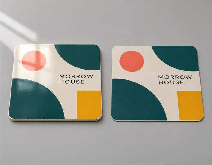
On offset-printed pulpboard, colors can appear less glossy and less saturated than the same artwork printed on coated paper. A vibrant red logo on your screen may appear as a rich but slightly softer red on pulpboard. This is normal ink absorption behavior, not a defect.
High-contrast designs with bold colors tend to perform better on pulpboard than subtle gradients or delicate tonal shifts. If your brand relies on precise color nuance, account for this absorption effect when preparing your artwork.
What Happens When You Convert Brand Colors for Print
Brand guidelines may specify colors in Pantone, RGB, and CMYK formats. For standard CMYK printing, artwork needs suitable CMYK values. Include any target Pantone/PMS references when color matching is important. The conversion is where shifts happen.
Some colors convert cleanly. Others do not. Some highly saturated oranges, blues, greens, and purples can be difficult to reproduce in standard CMYK. Whether a particular shade falls outside the printable gamut depends on the exact color, print process, board, and color profile. The print process approximates them as closely as possible, but the result will not match the screen exactly.
For standard CMYK orders, prepare artwork to our file specifications and review any color conversions before submission. If your designer works in RGB, have them review the CMYK conversion before submission rather than relying on an unchecked conversion during export. CMYK artwork helps you prepare for print, but its appearance on a screen remains a preview rather than a guarantee of the finished color.
This matters for keeping your brand recognizable across formats. Understanding which colors shift helps you maintain consistency across coasters, menus, signage, and packaging.
Colors That Shift Most in CMYK Conversion:
- Neon and fluorescent tones (no CMYK equivalent)
- Electric blues and purples
- Bright oranges
When Standard CMYK Does Not Apply: Foil Stamping and Glitter Inks
Not every coaster finish uses traditional process printing. Foil-stamped coasters and glitter ink coasters use specialty processes or inks to create effects that standard CMYK printing cannot reproduce on its own.
Foil stamping uses heat and pressure to transfer metallic film onto the substrate. The process applies a pre-made foil rather than mixing ink colors. The result is a reflective metallic finish that cannot be achieved with standard inks.
Glitter inks contain reflective particles suspended in a carrier. The sparkle effect varies depending on lighting conditions and viewing angle. These inks behave differently from standard process inks and produce results that a screen preview can't predict.
Discuss the selected finish, artwork requirements, and available samples before production. A CMYK swatch can provide a color reference, but it cannot reproduce the reflective appearance of foil or the sparkle of glitter ink. Discuss the intended color and finish together. A digital proof can show artwork placement but cannot demonstrate the finished physical effect.
The Proofing Step: Artwork Approval and Color Expectations
Proofing is not an upsell. It is not a formality. It is the checkpoint for reviewing wording, layout, placement, and orientation before printing.
Why Proofing Is Not Optional
Reviewing your proof and discussing critical color requirements before approval help reduce avoidable production errors.
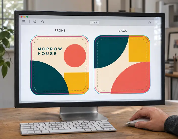
The workflow is straightforward: you submit artwork, we produce a digital proof, you review and approve it, then production begins. A digital proof confirms wording, layout, placement, and orientation. It is not a physical printed sample, so it cannot show you how the board texture will look or guarantee the exact final printed color. If you have specific color requirements, raise them before you approve the proof rather than relying on the proof itself to confirm final color. Turnaround timing starts after proof approval, not after order placement.
We do not bypass the proof step at Coaster Factory. Every order receives a proof. Every customer must approve before printing begins. This protects both parties from preventable errors.
A consistent proofing process is what keeps wasted print runs and customer complaints to a minimum. The proof confirms your layout and content are correct before production starts. Careful review helps prevent avoidable artwork errors.
What to Look for When You Review a Proof
When your proof arrives, do not glance at it and approve immediately. Take time to review it systematically.
Proof Review Checklist:
- Wording, layout, and orientation are correct
- Text is legible at final print size
- Backgrounds intended to reach the edge extend beyond the cut line to the required bleed
- Photos and gradients are positioned correctly and show no obvious issues in the supplied artwork
- Overall impression matches your brand intent
Use the proof to check wording, layout, placement, and orientation. Review small text and fine details at the intended printed size, and confirm bleed placement and safe zone positioning. Keep in mind the proof is a digital file, not a printed sample, so it won't show you exactly how color will look on the finished pulpboard. If color accuracy is critical to your order, discuss your specific requirements with us before approving.
Approve only when you are satisfied. Do not rush this step. Allow time in your schedule to review the proof and resolve questions before approval.
Production Notes: Color Accuracy and Print Limitations
Coaster Factory uses CMYK process printing for standard full-color coaster orders. Exact Pantone matches are not guaranteed. We are upfront about this because overpromising exact color matches leads to disappointed customers and wasted production runs.
On offset-printed pulpboard, the board's absorbency and surface texture can make colors appear softer than on coated stock. This is expected behavior, not a quality issue.
Proofing is required before every production run. Customers must approve the proof before printing begins. No exceptions.
How to Set Your Design Up for Success
For large solid black areas, ask our prepress team for the recommended black setup. Do not increase CMYK ink coverage arbitrarily.
Proper file preparation helps reduce artwork problems and avoidable color surprises in production.
Prepare artwork in CMYK for standard CMYK orders, and include target Pantone/PMS references for important brand colors. If you must convert, do it early in the design process so you can evaluate the results before submission.
Use high contrast between foreground and background elements. Pulpboard absorbs ink, so subtle tonal differences may compress or muddy together. Bold contrast holds up better.
Avoid very fine lines and very small text, especially reversed-out lettering. Ask us to review any details whose legibility is critical. Fine details may fill in or become illegible after ink absorption.
Keep critical elements inside the safe zone. Anything too close to the edge risks being trimmed during die-cutting.
Supply raster images at 300 ppi or higher at their final printed size, and preserve vector logos and graphics where available. Lower-resolution images can appear soft or pixelated at final print size.
For Value Pack and High Volume orders, allow at least 0.25 inch of bleed beyond the cut edge and keep important content at least 3/16 inch inside it. Follow the separate artwork guidance for Short Run orders.
Review our file specs page for complete artwork guidelines before submitting your order.
Choosing the Right Print Method for Your Brand
| Print Method or Finish | Best For | Color and Finish Behavior |
|---|---|---|
| Standard CMYK | Full-color logos, photos, and detailed graphics | Appearance depends on the print process and board. Offset coasters have a matte appearance; Short Run digital coasters have a slight sheen. |
| Foil Stamping | Metallic effects and premium brand presentation | Uses foil rather than a CMYK ink mixture to produce a reflective finish. |
| Glitter Ink | Sparkle effects for event, seasonal, or promotional designs | Contains reflective particles; the sparkle changes with lighting and viewing angle. |
Standard CMYK handles most brand applications. It is the default for custom coasters with full-color artwork, photographs, or detailed graphics.
Foil and glitter add visual impact, but their physical effects cannot be judged accurately from a standard digital artwork proof. Discuss how metallic or sparkle effects will work with the rest of your design before production.
Discuss Your Color Requirements Before You Commit to a Full Run
If you are unsure how your brand colors will translate to pulpboard, discuss your artwork, target colors, and print options with us before placing a large order.
If matching a brand color or an existing printed item is important, discuss the available color-matching options with us before production. Request a quote to start the conversation.
Get the Color Right the First Time
CMYK has limits. Pulpboard absorbs ink. Some colors will shift from screen to print. These are facts, not failures.
Careful artwork review and clear color requirements help reduce avoidable surprises before production. Before approving, check the artwork carefully and resolve any questions about your color requirements.
Key Takeaways:
- CMYK printing has a narrower color range than most screens. Plan for shifts, especially with bright oranges, electric blues, and neon tones.
- Pulpboard is porous. Offset-printed coasters have a matte appearance, while Short Run digital coasters have a slight sheen.
- Prepare CMYK artwork to the required specifications and review converted colors before submission. The screen preview does not guarantee the finished printed color.
- Foil stamping and glitter inks create specialty effects that standard CMYK alone cannot reproduce. Discuss the intended finish before production.
- Proof approval is mandatory. Turnaround begins after you approve, not after you order.
Next Steps:
- Review your brand files. Are they set up in CMYK or RGB?
- Identify any problem colors (neons, bright oranges, electric blues) and discuss alternatives with your designer.
- Build proof review time into your project timeline. Do not treat it as an afterthought.
- Request a quote to start your order and receive a proof for review.
Consistent results start with suitable artwork, clear color expectations, and careful proof review. Get the color right the first time.
Share: