Best Fonts and Colors for High Impact Custom Coaster Printing
 Good design is as little design as possible. - Dieter Rams
Designing a coaster might seem simple at first, but the details can make or break your final design. Fonts, colors, and layout choices determine how well your coasters represent your brand and grab attention. Understanding coaster design best practices helps ensure every piece you create not only looks professional but also leaves a lasting impression on your audience.
Whether your goal is to promote your restaurant, elevate your brewery's brand, or enhance your event with memorable details, your approach to coaster design should be intentional. Each choice contributes to how people perceive your business the moment they pick up a drink.
Coaster Design Best Practices: Key Elements for Success
Great coaster design begins with clarity. A well-planned layout, legible typography, and cohesive color scheme work together to create a polished appearance that reflects your brand identity. Before diving into details, take a step back and define your main goal. Are you designing coasters to promote a special event, reinforce your logo, or drive customers to your website? Your design choices should always align with that purpose.
Successful designers follow coaster design best practices by focusing on balance. Keep essential information easy to find, avoid clutter, and use hierarchy to guide the viewer's eye naturally. Remember that space is limited, so every element must serve a function. Even a single background color or accent line can change how your design feels and performs in print.
Choosing the Right Font for Your Coasters
Font selection is one of the most critical steps in any coaster design. The right font can communicate professionalism, playfulness, or luxury before anyone even reads the words. When designing coasters for your business, start with legibility. Thin or overly decorative fonts may look stylish on screen but often lose clarity when printed at small sizes.
Pairing fonts strategically adds character without sacrificing readability. For example, use a bold serif for your logo and a clean sans-serif for supporting details. This balance helps your drink coaster design feel intentional and well structured. Before finalizing your layout, print a proof at actual coaster size to confirm that your text remains sharp and easy to read in your final design.
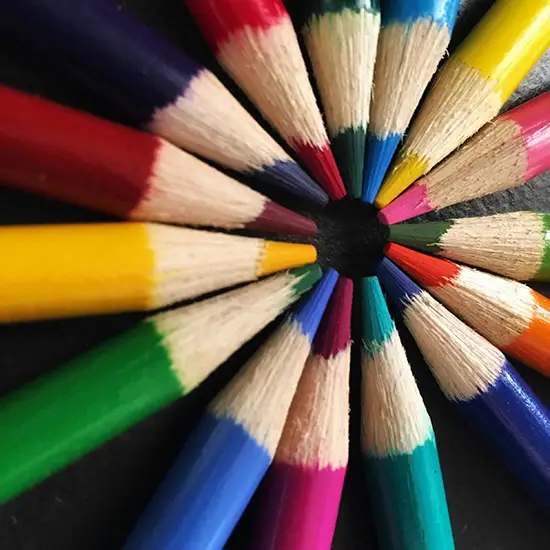
The Power of Color: How to Pick the Perfect Palette
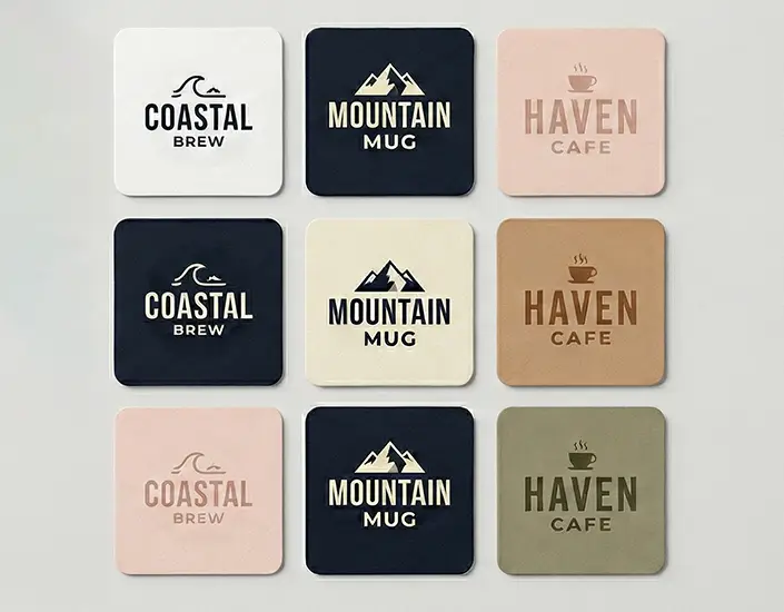
Color decisions influence both visual appeal and brand perception. A warm palette with reds and yellows creates energy and excitement, while blues and greens feel calm and trustworthy. Following coaster design best practices means choosing a palette that aligns with your message and your brand's established colors.
When experimenting with new design elements, consider contrast and tone. Light colors on light backgrounds tend to fade, while high-contrast combinations ensure your logo and text stand out clearly. If your brand already has signature hues, integrate them consistently across your drink coaster design and other printed materials. Consistency reinforces recognition, especially when customers encounter your logo in different contexts like menus or packaging.
The Role of Design Elements in Creating High-Impact Coasters
Design elements bring structure and movement to your layout. They help your audience understand what to focus on first and how to interpret your brand's tone. Effective coaster design best practices recommend incorporating simple geometric shapes, clean borders, or subtle textures to guide attention without overwhelming the main artwork.
These small choices make a large difference in print. Rounded edges, drop shadows, or layered shapes can give dimension, while keeping your overall design cohesive. Every line, pattern, or accent should have purpose. Visual balance ensures your coasters look professional from every angle and photograph well in marketing materials.
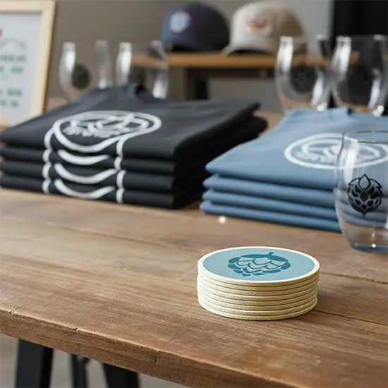
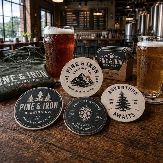
Incorporating Logos and Brand Identity
Your logo is the most important component of your coaster design. It represents your business at a glance and communicates what your brand stands for. When including your logo, give it enough space to breathe. Avoid crowding it with too many secondary graphics or excessive text.
If you're ordering custom coasters, request a digital proof to see how your logo prints on pulpboard. Proper alignment, spacing, and color matching ensure your final design looks as professional as possible once printed in bulk.
Using Visual Hierarchy to Guide the Eye
Visual hierarchy is what directs your audience's attention in order of importance. For example, your logo might appear largest, followed by your tagline, and then your contact information. When designing coasters, organize text and images so they naturally lead the viewer's eye in a clear flow.
Contrast, scale, and placement all contribute to this structure. A common mistake is trying to make every element equally prominent, which can confuse or distract the viewer. Instead, focus on simplicity and rhythm. The best coaster design best practices favor clean layouts that communicate instantly, even from across a bar or table.
Balancing Simplicity and Creativity in Design
While creativity drives attention, simplicity sustains it. Minimalist layouts with one or two strong focal points often perform better than designs filled with competing details. Leave room for white space, especially around key design elements. A clutter-free layout gives your brand a modern, confident look.
If you want to experiment with textures, gradients, or patterns, keep them subtle. Your final design should remain versatile enough to print cleanly on both blank coasters and custom-branded stock. The most effective drink coaster design tells your story quickly and clearly, even when viewed for just a few seconds.
Understanding the Importance of Fonts and Colors in Drink Coaster Design
The fonts and colors you choose play a major role in how customers perceive your brand. A cohesive drink coaster design tells a story through visual consistency. The same typography and color palette used across menus, signage, and marketing materials should carry through to your coasters. This creates harmony and strengthens recognition.
Coaster design best practices emphasize color psychology and readability. Each shade and typeface affects mood and interpretation. A script font paired with pastel tones might suit a boutique cafe, while bold typography with strong color contrast fits a sports bar or brewery. Before finalizing your coaster design, review your color scheme under real lighting conditions to see how colors appear in print. Natural light, indoor lighting, and glossy finishes can all influence how your coasters look in the customer's hand.
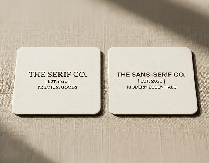
Fonts and Their Impact on Readability and Appeal
Fonts directly influence how easy it is for customers to engage with your message. Serif fonts often convey tradition, while sans-serif styles feel modern and approachable. If your design includes small text such as contact information or a website, choose fonts that maintain clarity even at reduced size.
Test a few variations before locking in your final design. It is also helpful to maintain consistency between front and back coaster layouts to keep your drink coaster design unified. A clean, readable font helps ensure that your message stays clear whether the coaster is viewed up close or from across the table.
Color Combinations That Make Your Design Stand Out
Color pairing is one of the most effective design elements you can use to make your coasters visually striking. High-contrast combinations like black and white or navy and gold can create elegance, while complementary palettes such as teal and coral bring vibrancy and energy. Coaster design best practices recommend limiting your palette to two or three main hues to maintain focus.
Avoid overusing gradients or heavy backgrounds that may distract from your message. Instead, balance light and dark tones to help logos and typography pop. If your brand uses specific colors, match them closely for consistent printing across all materials. A cohesive drink coaster design reinforces your professional image and leaves a positive impression with every use.
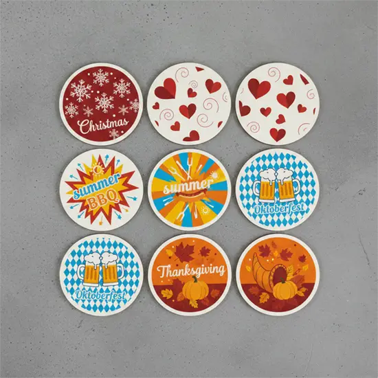
Tips for Designing Coasters for Events and Corporate Branding
Designing coasters for events or branded campaigns requires both creativity and strategic thinking. Start by identifying the purpose of the coaster. Is it a promotional giveaway, an event keepsake, or a restaurant marketing tool? Once you know the intent, align your visuals accordingly.
For corporate settings, stick to clean lines and simple color palettes that match company branding. Include subtle logo placement and perhaps a slogan or web address. For casual gatherings or themed events, you can be more playful with fonts, shapes, and background textures. Regardless of tone, all designs should maintain print-ready clarity and brand consistency.
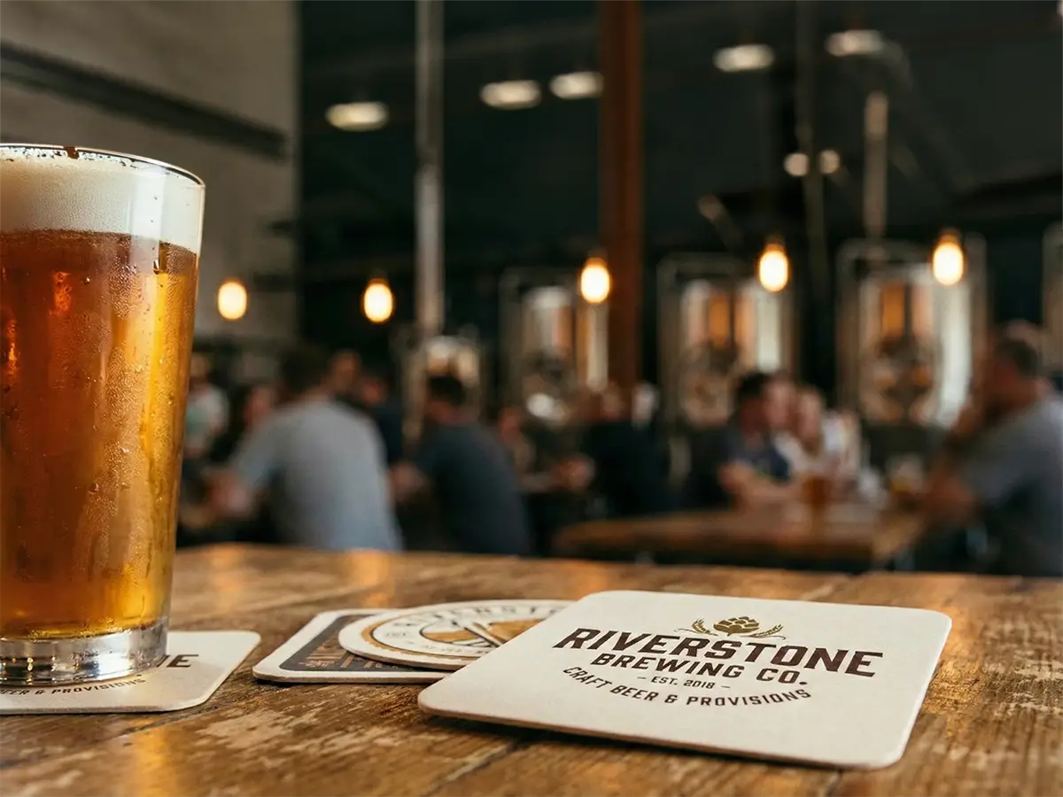
Businesses that use restaurant coasters as part of their marketing strategy often see long-lasting engagement. Coasters travel with customers beyond the venue and are often photographed, reused, or shared. This kind of visibility transforms a small design into a high-value promotional tool.
Final Design Checklist for High-Impact Coasters
Before submitting your artwork for production, review every part of your final design. This step ensures accuracy and prevents costly reprints. Below is a simple checklist to guide your review process.
- Resolution: Confirm that your artwork is high resolution. Blurry graphics or low-quality images will show once printed. If you're unsure about resolution requirements, be sure to confirm with your coaster supplier.
- Safe Zones: Keep essential text and logos within designated safe zones to prevent trimming errors.
- Bleed Setup: Include appropriate bleed margins to ensure edge-to-edge printing without white borders.
- Color Mode: Convert all files to CMYK for accurate print color. RGB colors can shift when printed.
- Font Outlines: Convert fonts to outlines or embed them to prevent substitution errors.
- Material Check: If you are printing on pulpboard, recycled paper, or gloss stock, ask to see how similar designs react to ink saturation.
Conclusion: Create Custom Coasters That Leave a Lasting Impression
A thoughtfully designed coaster can be far more than a drink accessory. It is a piece of branding that lives in your customer's environment, often long after the first impression. From typography to color pairing, every decision matters when creating a cohesive and memorable layout.
When you combine strong visuals with practical coaster design best practices, your brand message becomes clear and lasting. Whether you are promoting a restaurant, launching a new product, or creating keepsakes for an event, your coasters can reflect your company's character and values in a simple yet powerful way.
The journey from concept to final design is both creative and strategic. Start by defining your goals, refine your layout with intention, and finalize your artwork with attention to detail. When you are ready to bring your ideas to life, trust a professional printer to handle the rest.
Share: